2025
Increase Conversion Rate and CES for the Personal Loan Feature in a Fintech App
José Manuel Zevallos, Stanford University
Rol
Product Design
UX Strategist
UI Design
Category
App mobile
iOS / Android
Project Type
Banking app
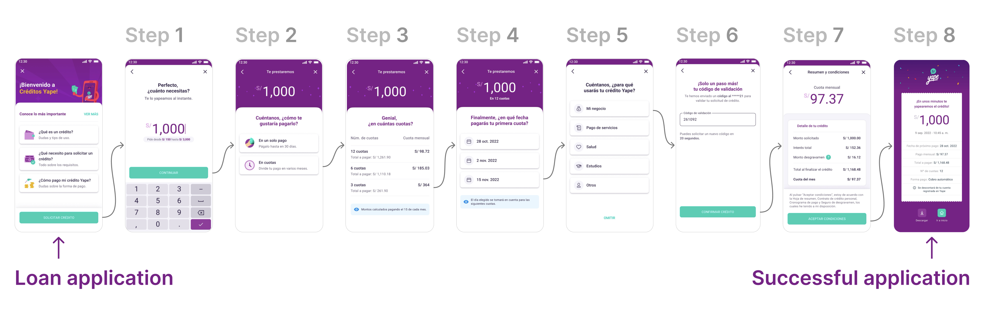
Loan Application Journey

Professional website of José Manuel Zevallos
Digital Media Designer © 2025. All rights reserved.
zevallosj147@gmail.com
LinkedIn: in/jmanuelzevallos

Challenge
Redesign, prototype, and test Yape’s multi-installment credit feature with the goal of:
- Increasing user conversion from 0.3% to 2.3%
- Improving the transactional Customer Effort Score (CES) from 68% to 85%
- Raising the number of loans granted from 80K to 140K per month
The proposed solution must comply with all legal regulations and accessibility standards required by the Peruvian Superintendence of Banking and Insurance (SBS).
Hypothesis
We believe the low conversion rate and CES in the multi-installment credit feature are due to users not clearly understanding the loan conditions, distrusting the digital process, or encountering friction when trying to simulate, compare, or confirm their request.
If we redesign the experience to align with the real progress users seek (control, clarity, speed, and trust), we will increase conversion, improve perceived effort, and accelerate loan placements.
Summary
With the sustained increase in demand for digital financial products, Yape identified a key opportunity to improve the experience of its multi-installment credit feature. Although already live in production, this solution showed an extremely low conversion rate (0.3%) and a transactional Customer Effort Score (CES) of 85%, revealing significant friction points in the process. In this context, redesigning the entire digital experience was defined as a strategic priority. This involved mapping all user touchpoints along the journey to uncover the true barriers preventing users from progressing and to create a solution aligned with their motivations, expectations, and trust level in digital credit products.
Problem Users Faced
Users could not find a clear, trustworthy, or decision-oriented experience. The current interface caused confusion about loan amounts, installments, and conditions, and lacked enough guidance or validation throughout the process. Without an experience that conveyed clarity, transparency, and support, many users abandoned the flow before completing the application.
Business Objective
Increase adoption and recurring use of Yape’s multi-installment credit feature as a key tool to retain users within the ecosystem, strengthen brand loyalty, and boost platform usage frequency. By making access to digital microcredits easier—helping users solve real needs or achieve personal goals—Yape aims to position itself as a trusted financial partner that delivers sustained value in customers’ lives.
Product Owner & Business Request
To research, evaluate, propose, and design a new experience for the multi-installment credit feature with the goal of increasing conversion, improving the perceived user effort, and boosting monthly loan placement — while ensuring compliance with SBS legal and accessibility guidelines.
Applied Methodology
To tackle this challenge, we applied the Double Diamond methodology, complemented by the Jobs to Be Done (JTBD) framework. This approach not only structured the design process clearly but also uncovered the underlying motivations driving users to request a multi-installment loan, enabling us to align business goals with user needs.
This case study has been adapted for demonstration purposes only. Names, data, metrics, and specific details have been modified to protect the confidentiality of the companies involved and to avoid disclosing sensitive information. This document focuses on showcasing the strategic design process, evidence-based decision-making, and potential impact on user experience. The examples faithfully represent typical challenges without compromising the privacy of teams or real users.
Discover
Here we start by generating a holistic understanding of the problem, integrating quantitative and qualitative data to map not only user behavior but also business dependencies, technical constraints, and the regulatory context. My approach goes beyond identifying friction points in the flow — it focuses on uncovering strategic opportunities that align business objectives with the users’ true motivations, prioritizing the issues with the greatest impact on conversion and trust.
Current funnel mapping
Step-by-step details
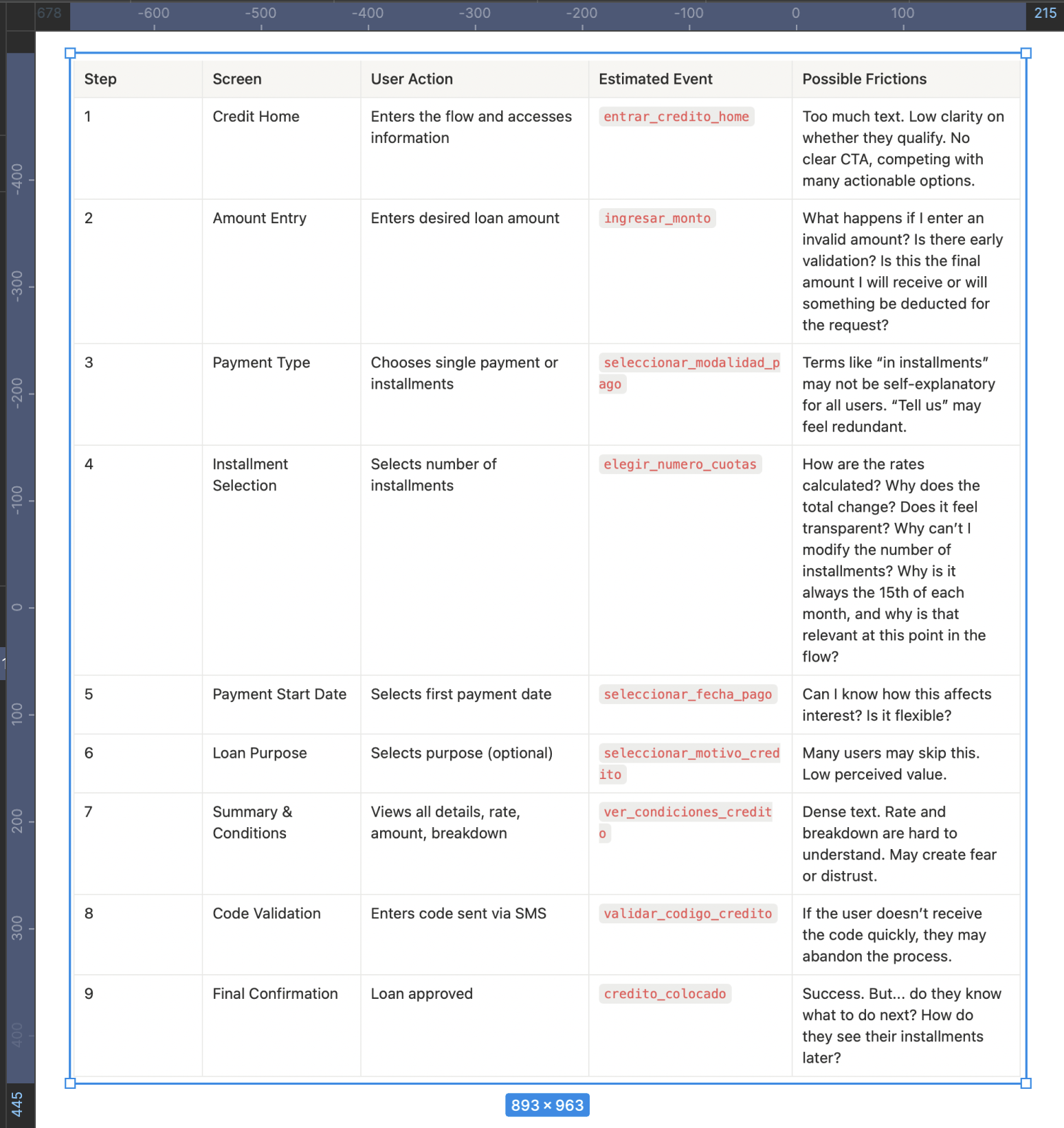
Initial Hypotheses Based on the Funnel
- High drop-off in steps 4–7: When financial information appears, many users stop or abandon. Conditions are not clear enough or generate distrust.
- Summary overwhelms instead of simplifying: The conditions screen lacks visual hierarchy. The breakdown informs but doesn’t educate. This goes against heuristics like “visibility of system status” and “help and documentation.”
- Waiting times for validation: If the SMS code doesn’t arrive quickly or errors occur, abandonment is likely.
- No early eligibility indicators: Many users could reach step 7 without knowing if they actually qualify. This creates frustration.
- Lack of emotional transparency: No messages build trust or emotional reassurance during the process (e.g., “Your loan is secure,” “No hidden fees”).
Visual Funnel Application Loan
Key Insights
- Biggest drop-off: Between “Summary & Conditions” and “Validation,” suggesting friction caused by distrust, doubts, or lack of clarity.
- High early abandonment (steps 1–4): Nearly 70% drop-off here, making this the most critical section where users face inconsistencies or fail to understand key information, leading to distrust.
- Silent abandonment in step 4 (installments): Likely due to perceived high cost or confusion about the total amount payable.
- Poorly qualified users advance too far: Many reach late steps without knowing if they’re eligible, which negatively impacts the overall experience and CES.
- 0.3% conversion rate: Validates the need to redesign abandonment points by increasing clarity, guidance, and trust during critical moments.
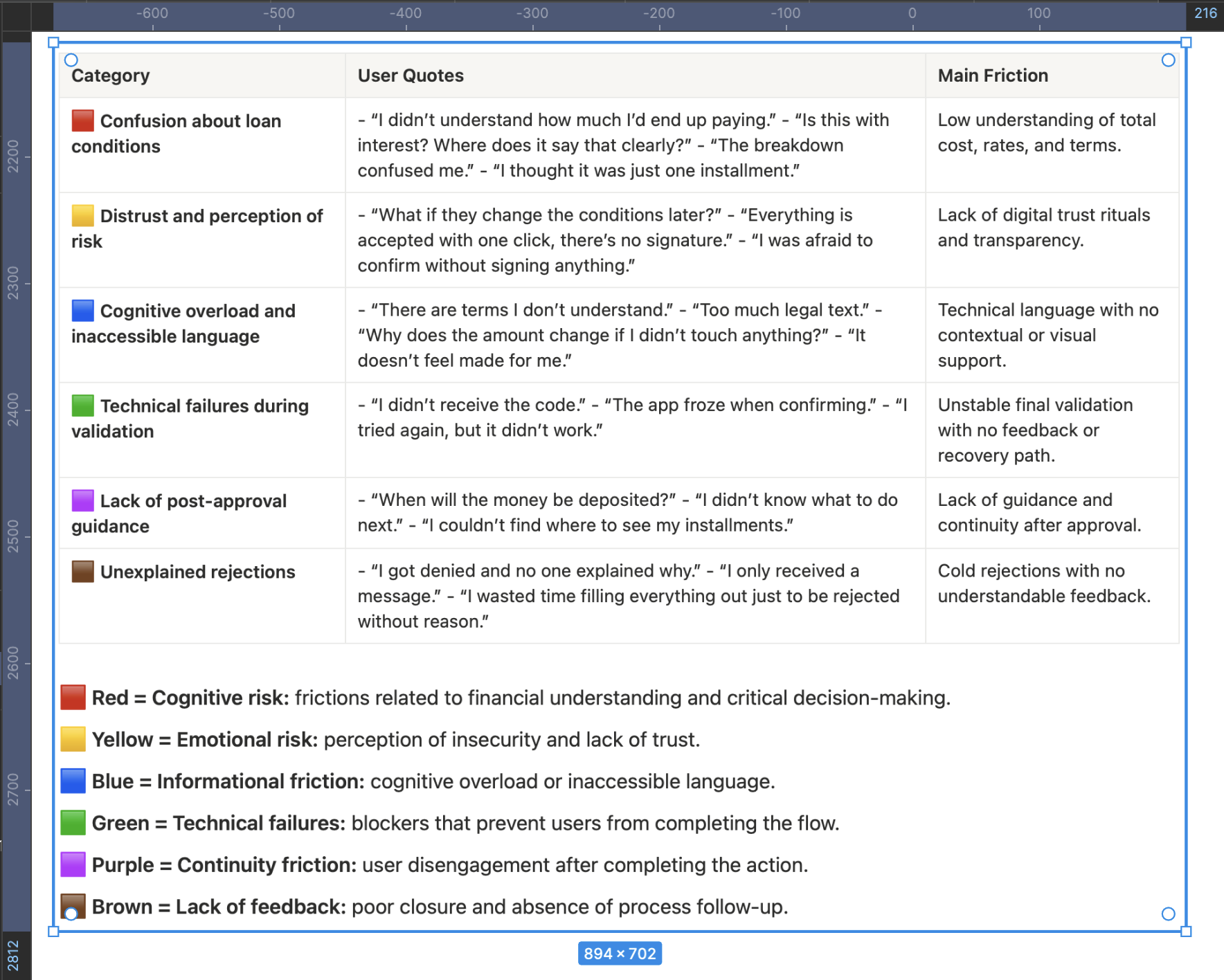
Affinity Map
Customer Journey Map
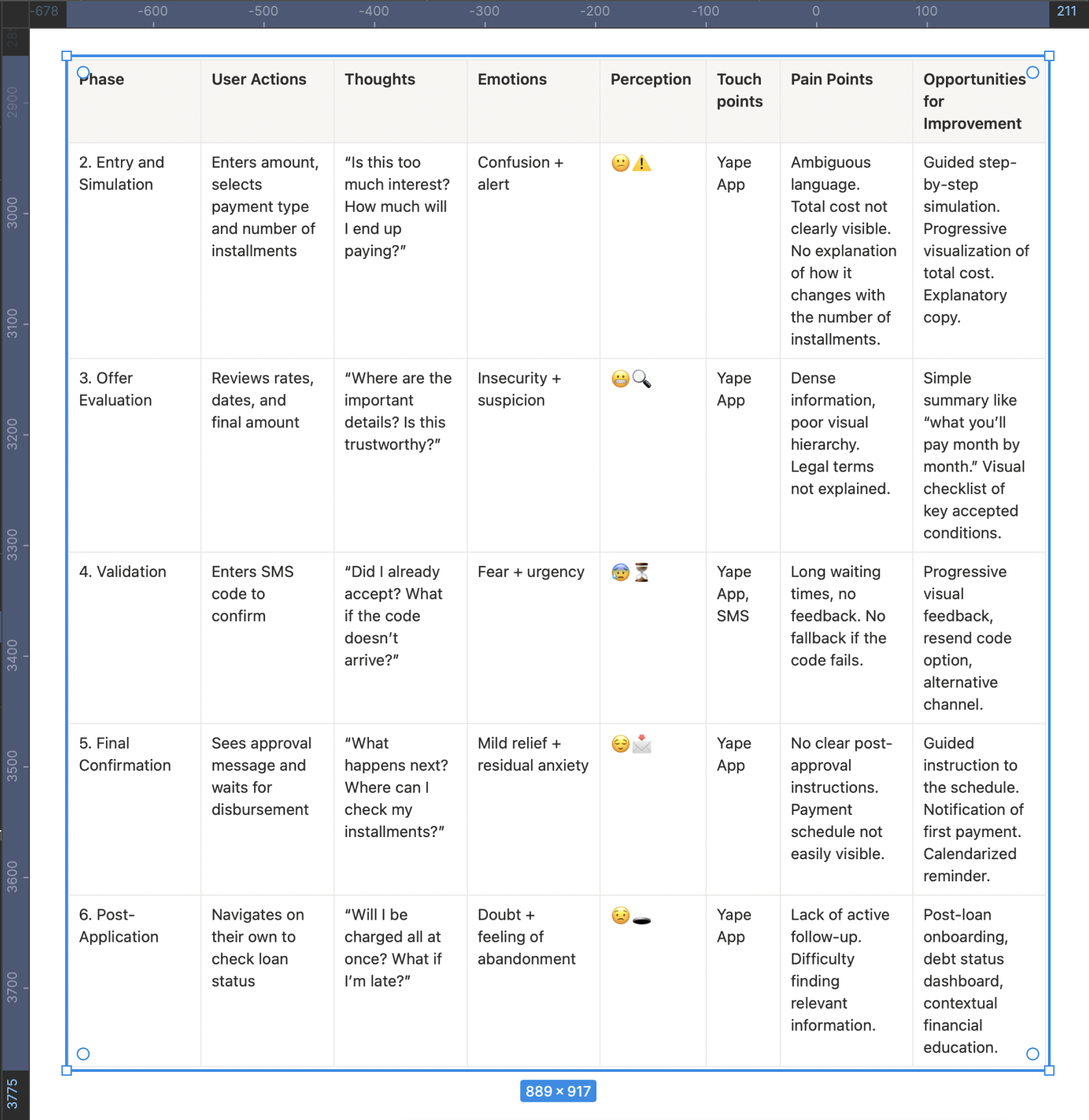
This map not only structures the user journey but also exposes the critical moments where the emotional experience breaks, affecting both conversion and trust.Each phase is aligned with a channel, an emotion, and a clear opportunity, allowing design and content decisions to be made based on real evidence.
User Emotional Journey Map
To build this journey, qualitative research was conducted, combining direct observation, in-depth interviews, and post-flow support analysis.
The goal was to understand not only what users do but what they feel, fear, and what stops them during the process. Two real users were interviewed (two who completed the flow and one who didn’t; ideally, there should have been seven) through moderated remote sessions.Each participant was asked to navigate the current flow on their own device while thinking aloud — expressing their thoughts, doubts, and emotions.
This technique made it possible to identify critical moments of insecurity, confusion, or cognitive overload that are not always verbalized spontaneously.
In parallel, three support tickets from the phone banking channel and three post-interaction email survey responseswere analyzed. These sources revealed common frictions related to the lack of clarity in credit conditions, distrust in the digital interface, and absence of explanations for automatic rejections.
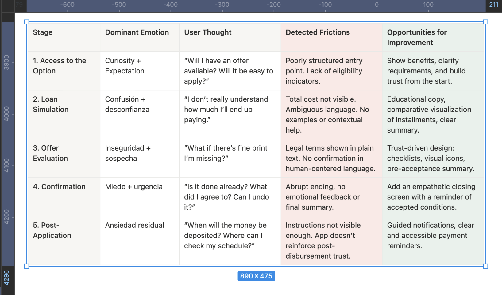
The analysis of the Emotional Journey Map shows that the main negative emotions emerge during the simulation, offer evaluation, and confirmation stages — where users report feelings of confusion, insecurity, and fear.
These emotional states are not isolated but are a direct consequence of previously identified cognitive and trust-related frictions found in support tickets and surveys: lack of clarity about the total cost, technical or ambiguous language, and absence of mechanisms that reinforce understanding and control.
This convergence between the emotional and functional dimensions reinforces the initial hypothesis: the current flow fails not because of its structure, but because of its inability to build emotional security and operational transparency.
Key Findings Summary
The research revealed that the low conversion rate (0.3%) and low CES (71%) are not the result of a single error, but rather a chain of cognitive, emotional, and structural frictions that affect the user experience at multiple levels. These frictions are concentrated mainly in the core stages of the flow (simulation, evaluation, and summary), where users face a critical combination of informational ambiguity, distrust in the system, and lack of clear guidance.
Quantitative funnel analysis showed a 92% drop-off from entry to loan placement, with the most severe abandonments occurring at the “summary and conditions” step. This was validated qualitatively through interviews, contextual observations, and support ticket reviews, where users expressed feelings of confusion (“I don’t understand the total”), fear (“What am I agreeing to?”), and frustration (“I was rejected without explanation”).
A concerning pattern also emerged: the current design does not communicate eligibility from the start, does not educate users about the financial process, and fails to reinforce trust before the final decision.
In summary, the problem runs deeper than it appears — it’s not just about redesigning screens. It requires a structural transformation of the flow, guided by three core principles:
- Radical clarity to reduce ambiguity and cognitive load.
- Assisted autonomy to help users make informed decisions with contextual support.
- Trust built from the first screen through to the final resolution.
Find a more emotional way to capture the user’s attention.
Define
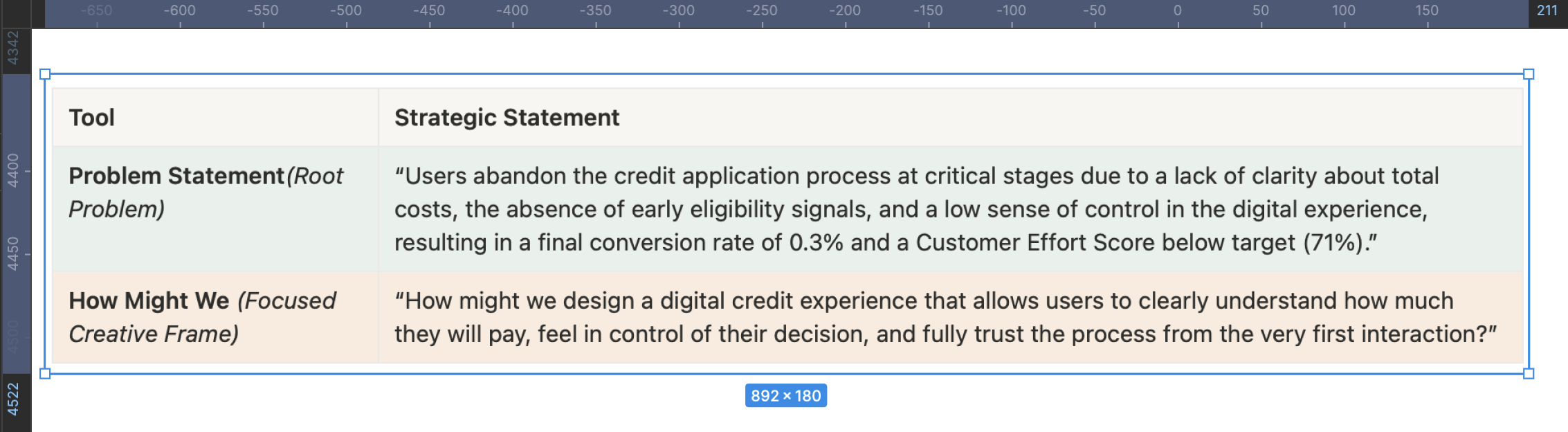
The Problem Statement allows me to articulate the challenge from its root, connecting structural causes with tangible metrics, aligning the business and stakeholders under an evidence-based narrative. The How Might We serves as a bridge between diagnosis and action, guiding ideation toward solutions that truly strengthen user understanding, control, and trust. Together, these tools transform the complexity of the problem into a clear design opportunity with measurable impact on both the user experience and business outcomes.
This matrix translates the complex findings from the Discover phase into a strategic action map that enables the team to decide where to invest design, development, and business efforts based on expected impact. It helps prioritize without falling into reactive decisions, avoiding wasted time on low-value initiatives or those with high emotional cost for the user.
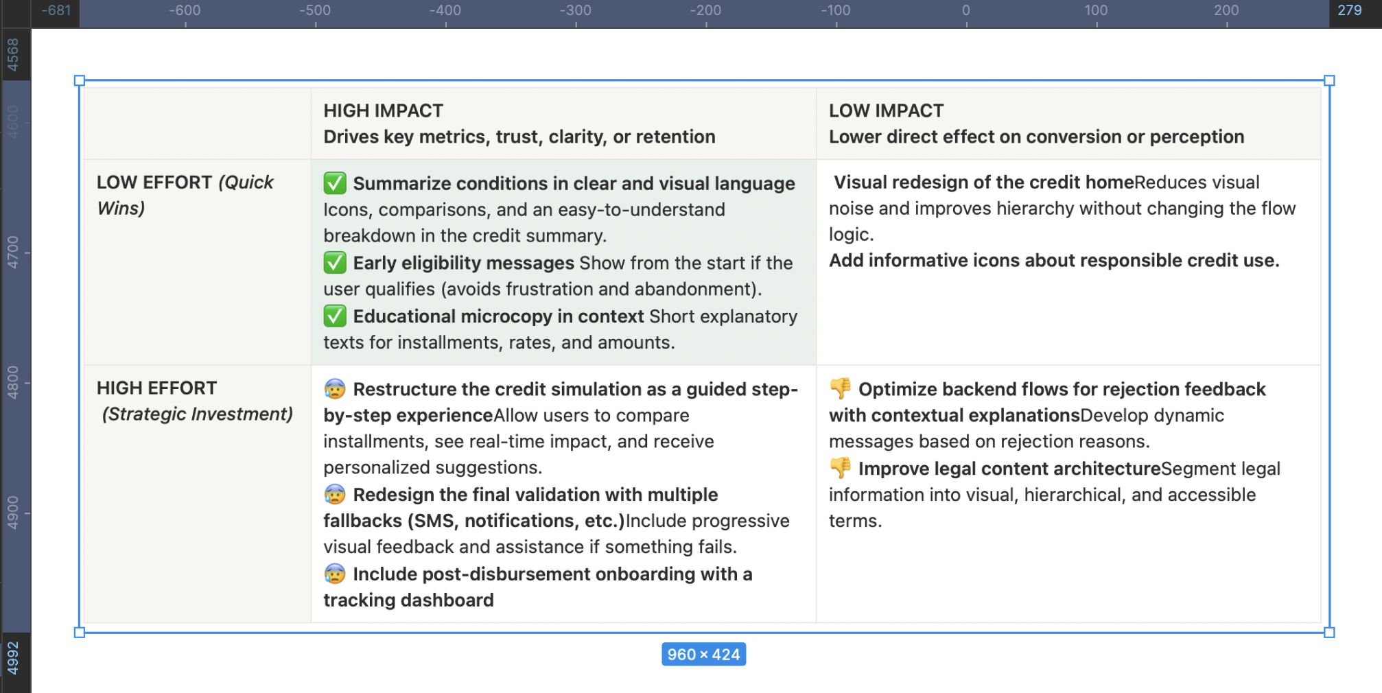
Main Findings from Cross-Referencing the Impact/Effort Matrix with the Affinity Map
- The “confusion about credit terms” category (red affinity) directly connects with low-effort, high-impact initiatives such as a clear visual summary of conditions and explanatory microcopy. This validates that much of the abandonment is not due to technical complexity but rather to unnecessary cognitive load. The finding is clear: simplifying and visually prioritizing critical information can drive significant improvements without the need to restructure the entire flow.
- The “distrust and risk perception” category relates to solutions such as early eligibility messages, post-disbursement onboarding, and validation with fallback mechanisms. All of these have medium to high impact and variable effort. The pattern shows that trust is built before and after the critical action, not at the moment of conversion. This turns continuous support into a structural element of the experience, not just a UX add-on.
- The “cognitive load and inaccessible language” category overlaps with more demanding initiatives such as a guided step-by-step simulation and improvements in the legal content architecture. These require medium to high effort but offer a clear return in reducing the Customer Effort Score (CES). The key insight here is that financial language cannot be assumed to be neutral—if it isn’t explained, it becomes a blocker.
- “Rejection without explanation” frictions emerge as some of the most frustrating for users but have few low-effort solutions. Contextual feedback after rejection is high effort but essential to maintain perceptions of fairness and transparency. This aspect is critical for the product’s long-term credibility.
Finally, technical frictions (“failed validation” and “post-approval abandonment”) require strategic investment in backend and interaction design. Improving validation with fallback mechanisms and providing a clear post-loan dashboard not only addresses functional issues but also directly impacts experience continuity and user retention.
JTBD
Identify the Main Job (Main Functional Job)
What does the user really want to achieve—beyond using the app or completing a form?
In this case: Access money reliably, without uncertainty or friction, to solve a specific short-term need.
This step should not describe an action, but a desired outcome. Here, we avoid defining the job as “using a loan in Yape,” and instead redefine it as “solving an urgent need with clarity, security, and autonomy.”
Map the Emotional and Social Jobs
What emotions or social perceptions are involved in this decision-making process?
Emotional: Feeling in control, not vulnerable or exposed; reducing the anxiety of taking on debt without understanding it.
Social: Demonstrating responsibility to my surroundings (family, partner), maintaining the image of a reliable or financially responsible person.
Including these jobs allows us to design microcopy, validations, or guidance that reinforce not only the rational decision but also its emotional and reputational acceptance.
Define the Moments of Friction Within the Progress
Not understanding the total cost of the loan:The user cannot clearly visualize how much they will end up paying, what the total amount includes, or how values change when modifying the number of installments. This friction is cognitive but also emotional: the fear of going into debt without fully understanding the terms prevents progress.
Not knowing if they qualify from the start:Entering the flow without any indication of eligibility or pre-qualification creates uncertainty from the very first step. This gap undermines confidence and causes many users to proceed through trial and error, wearing down their perception and cognitive effort.
Not receiving feedback after being rejected:When a loan is denied, the user receives no clear explanation or alternative path (e.g., “what to improve” or “when to try again”). This reinforces a perception of arbitrariness, undermines the system’s legitimacy, and causes emotional disengagement.
Lack of clear guidance after disbursement:After receiving the loan, the user cannot easily find the payment schedule, reminders, or debt status. This lack of continuity produces lingering anxiety and erodes their sense of control.
These moments are far more than interface issues: they are breaks in the user’s emotional and functional progress that sabotage the purpose they sought through the loan. Identifying them gives design a truly strategic—not merely aesthetic—role.
Formulate the JTBD Statement
-“When I need to solve an urgent financial need from my phone, I want to clearly understand how much I’ll pay and feel in control of the process, so that I can make a safe, fast, and regret-free decision within an app I already use and trust”-
This statement accurately captures:
- The functional context: a real urgency handled through a familiar digital channel.
- The core need: clarity, control, and trust.
- The desired outcome: making an informed decision without doubts or unexpected negative consequences.
You can create variations to map different user types or situations, but this core statement covers the most representative and strategic case.
Success Criteria Based on the JTBD
To fulfill the user’s job, the experience must achieve the following:
- The user understands the total loan cost in less than 10 seconds.Success indicator: percentage of users who proceed after viewing the summary without going back or abandoning the flow.
- The user knows from the start whether they qualify for a loan.Indicator: reduction in mid-flow drop-off rate among ineligible users.
- The user feels confident and autonomous without human assistance.Indicator: post-flow CES improves to 85% or higher; fewer support tickets citing “I didn’t understand what I accepted.”
- The user has immediate and clear access to their payment schedule and debt.Indicator: number of visits to the installment and payment view within three days after disbursement.
- Rejected users receive a clear and understandable explanation.Indicator: lower volume of rejection-related tickets and higher intention to retry in the future.
The Moment of Truth
After of all collaborative work, user interviews, data analysis, ticket reviews, and the meticulous construction of design frameworks, the Product Owner of the digital channel approaches with a question that encapsulates the business’s expectations:
“Now that we’ve done all this research… what do we actually have? What do we know now that we didn’t know before? What was all this for?”
It’s a valid question. In fact, it’s the question every good product team should ask before making redesign decisions.
Develop
Desk Research
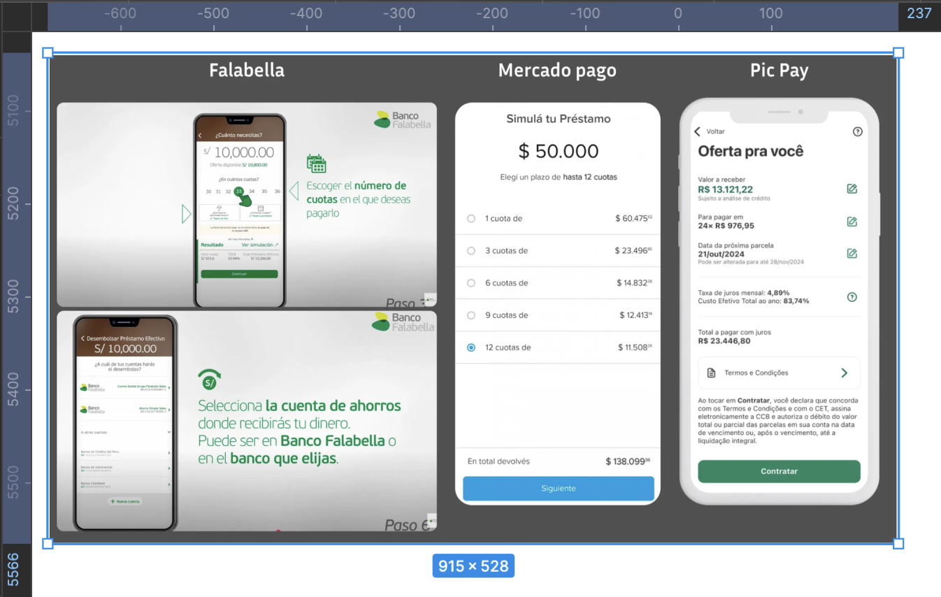
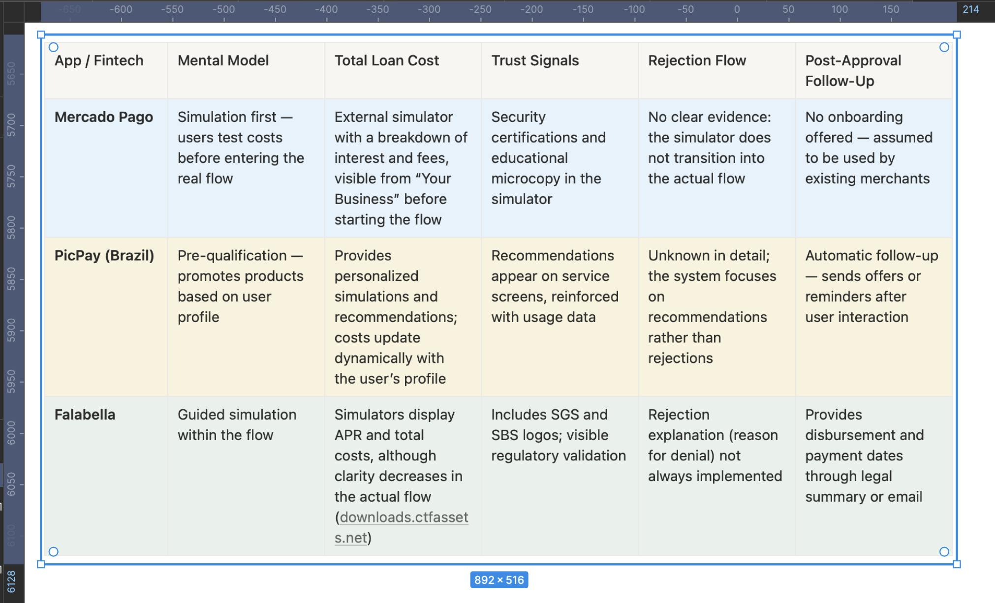
A comparative analysis was conducted on more than five relevant banking applications, focusing on their loan application flows. However, for this detailed study, three main applications were selected for their similarity in credit product features, allowing for a more precise and contextual strategic comparison with Yape’s current experience.
Strategic Insights from the Benchmark
Mercado Pago stands out for allowing users to simulate the total loan cost before starting the active application, but its flow tracking, rejection handling, and onboarding are absent—representing a clear opportunity for improvement in Yape.
PicPay, although not fully visible in its end-to-end flow, drives engagement through personalized recommendations and dynamic simulations, reinforcing a mental model of trust and contextual relevance.
Falabella emphasizes regulatory security but tends to be more rigid or confusing in rejection decisions and post-loan follow-up.
How can this be applied to Yape?
- Incorporate an initial simulator that clearly displays the total cost, supported by microcopy and legal backing.
- Add visual and communication trust elements on every screen (e.g., SBS seals, microcopy about data protection).
- Create a structured rejection flow with clear explanations of the reasons and alternative next steps.
- Design a proactive post-approval follow-up, including a payment schedule dashboard, notifications, and easy access to the payment plan.
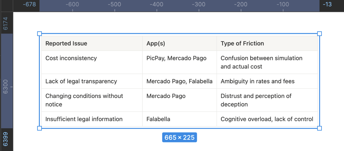
Main Frictions Detected
Validation of Initial Wireframes
To begin creating the first wireframes with a strategic foundation aligned to the previous documentation, it’s essential to organize the work around critical moments of the flow, directly addressing identified frictions, insights, and opportunities.
Below is the prioritized list of elements to address:
1. Credit Landing Screen
- Eligibility clarity: personalized message like “You have a pre-approved offer.”
- Reduced visual hierarchy: remove competing CTAs and highlight the primary action.
- Trust microcopy: “No hidden fees,” “Quick review,” etc.
2. Guided Simulator
- Step 1: Loan amount with immediate feedback if the value is out of range.
- Step 2: Payment type (single or multiple installments) with visual explanation.
- Step 3: Number of installments with a progressive breakdown of the total amount to pay.
- Dynamic visualization of interest impact based on user choices.
3. Offer Summary
- Clear visual hierarchy: monthly payment, total to pay, rates.
- Checklist with icons: “Your loan includes,” “Does not include,” “Term,” “First payment.”
- Validated CTA: “I want this option,” with a reminder of terms and conditions.
4. Validation and Confirmation
- SMS code input screen with a clear fallback: “Didn’t receive the code?”
- Estimated validation time with a progress indicator component.
- Emotional success message: “Your loan was approved. The money will be deposited within X hours.”
5. Post-Approval
- Post-loan onboarding: summary of installments, key dates, and next steps.
- Direct access to the payment schedule.
- FAQ or support section for common questions.
6. Alternative Rejection Flow
- Empathetic and clear message: “This time we couldn’t approve your loan.”
- Guiding reason: e.g., “You didn’t meet the minimum requirements.”
- Recovery call to action: “Learn how to improve your eligibility.”
7. Reusable Trust Component
- Security badges, legal icons, and certified accessibility (SBS and privacy).
- Inclusive and explanatory language throughout the flow.
Prototype
This high-fidelity, interactive prototype faithfully recreates the end-to-end experience of the redesigned multi-installment credit flow. It not only validates key usability improvements but also acts as a single source of truth to align business, technical, and legal stakeholders. Every interaction reflects decisions grounded in user research, WCAG 2.2 accessibility standards, and core business KPIs — ensuring an experience that drives conversion, builds trust, and minimizes user effort.
Explore the prototype
To view the prototype in full screen, click this button:

To restart the prototype from the first screen, click this button:

Post-Launch Metrics Analysis
- Experimental design: A/B test 50/50 (Control = current flow, Test = redesign), 6 weeks, random and mutually exclusive audiences.
- Unit of analysis: sessions with credit intent (event entrar_credito_home).
- Instrumentation: events per funnel step, timestamps for time-to-complete, eligibility attributes, SMS/OTP status, rejection reasons, accessibility (use of Dynamic Type, screen reader), device/OS, and network.
- North Star metric: conversion rate to “loan disbursed.”
- Guardrails: transactional CES, rejection rate, technical friction (OTP failures), crash-free sessions, load times, and early delinquency metrics (D+7/D+30).
“Experience & Effort” Dashboard
- Transactional CES post-flow (CSAT/CES blend).
- % of users going back from “Summary and conditions.”
- Perceived clarity (1-question micro-survey: “Did you understand the total cost?” (Yes/No).
“Explained Rejections” Dashboard
- % of rejections with a displayed reason.
- 30-day retry rate.
- Tickets tagged as “rejection without explanation.”
Learnings & Reflections
This project was not just an exercise in designing screens, but a strategic effort that spanned several months and activated the full spectrum of my skills as a Senior Product Designer. From deep qualitative research to facilitating stakeholder alignment workshops and prioritizing high-impact initiatives, every phase created measurable impact within the organization. The research became a constant reference point: it is still mentioned today in leadership meetings and business teams as an example of how a well-structured discovery process can transform a product strategy.
What I’m Most Proud Of
What I value most from this project is transforming an abstract problem (“low conversion”) into a clear, actionable diagnosis that guided the entire redesign strategy. The qualitative research I led — interviews, observations, and ticket analysis — not only uncovered UX frictions but also revealed the emotional and cognitive roots of user drop-off: distrust, fear, and lack of clarity. This work was not just “research”; it was business design.
What I Would Have Done Differently
Although we uncovered highly valuable insights, I would have enriched the process with three additional actions:
- Early usability testing: Testing low-fidelity prototypes before aligning the roadmap with development would have been valuable to detect micro-interaction frictions and optimize earlier, reducing technical effort later.
- Real-time impact measurement: I would have liked to implement CES and conversion metrics directly within the prototype to measure improvements before release.
What I Would Do Next
The conclusions remain fully relevant: radical clarity, assisted autonomy, and built trust must continue to be the pillars of the product.
If I were to move forward with the next phase, I would focus on:
- Data-driven iteration: Measure conversion and CES post-launch in real time to identify optimization opportunities.
- Contextual financial education: Add micro-learning within the flow to help users make responsible decisions.
- Gamified post-loan onboarding: Transform debt management into a positive, proactive experience that strengthens user trust in Yape.
- Multichannel strategy: Ensure consistency across communication (app, email, notifications) to reduce doubts and support tickets.
Ultimately, this project taught me that designing fintech experiences is not just about creating usable interfaces — it’s about building trust in a context where people are putting their financial and emotional security on the line. That is the true measure of success.
2025
Increase Conversion Rate and CES for the Personal Loan Feature in a Fintech App
José Manuel Zevallos, Stanford University
Rol
Product Design
UX Strategist
UI Design
Category
App mobile
iOS / Android
Project Type
Banking app
Loan Application Journey
Challenge
Redesign, prototype, and test Yape’s multi-installment credit feature with the goal of:
- Increasing user conversion from 0.3% to 2.3%
- Improving the transactional Customer Effort Score (CES) from 68% to 85%
- Raising the number of loans granted from 80K to 140K per month
The proposed solution must comply with all legal regulations and accessibility standards required by the Peruvian Superintendence of Banking and Insurance (SBS).
Hypothesis
We believe the low conversion rate and CES in the multi-installment credit feature are due to users not clearly understanding the loan conditions, distrusting the digital process, or encountering friction when trying to simulate, compare, or confirm their request.
If we redesign the experience to align with the real progress users seek (control, clarity, speed, and trust), we will increase conversion, improve perceived effort, and accelerate loan placements.
Summary
With the sustained increase in demand for digital financial products, Yape identified a key opportunity to improve the experience of its multi-installment credit feature. Although already live in production, this solution showed an extremely low conversion rate (0.3%) and a transactional Customer Effort Score (CES) of 85%, revealing significant friction points in the process. In this context, redesigning the entire digital experience was defined as a strategic priority. This involved mapping all user touchpoints along the journey to uncover the true barriers preventing users from progressing and to create a solution aligned with their motivations, expectations, and trust level in digital credit products.
Problem Users Faced
Users could not find a clear, trustworthy, or decision-oriented experience. The current interface caused confusion about loan amounts, installments, and conditions, and lacked enough guidance or validation throughout the process. Without an experience that conveyed clarity, transparency, and support, many users abandoned the flow before completing the application.
Business Objective
Increase adoption and recurring use of Yape’s multi-installment credit feature as a key tool to retain users within the ecosystem, strengthen brand loyalty, and boost platform usage frequency. By making access to digital microcredits easier—helping users solve real needs or achieve personal goals—Yape aims to position itself as a trusted financial partner that delivers sustained value in customers’ lives.
Product Owner & Business Request
To research, evaluate, propose, and design a new experience for the multi-installment credit feature with the goal of increasing conversion, improving the perceived user effort, and boosting monthly loan placement — while ensuring compliance with SBS legal and accessibility guidelines.
Applied Methodology
To tackle this challenge, we applied the Double Diamond methodology, complemented by the Jobs to Be Done (JTBD) framework. This approach not only structured the design process clearly but also uncovered the underlying motivations driving users to request a multi-installment loan, enabling us to align business goals with user needs.
This case study has been adapted for demonstration purposes only. Names, data, metrics, and specific details have been modified to protect the confidentiality of the companies involved and to avoid disclosing sensitive information. This document focuses on showcasing the strategic design process, evidence-based decision-making, and potential impact on user experience. The examples faithfully represent typical challenges without compromising the privacy of teams or real users.
Discover
Here we start by generating a holistic understanding of the problem, integrating quantitative and qualitative data to map not only user behavior but also business dependencies, technical constraints, and the regulatory context. My approach goes beyond identifying friction points in the flow — it focuses on uncovering strategic opportunities that align business objectives with the users’ true motivations, prioritizing the issues with the greatest impact on conversion and trust.
Current funnel mapping
Step-by-step details
Initial Hypotheses Based on the Funnel
- High drop-off in steps 4–7: When financial information appears, many users stop or abandon. Conditions are not clear enough or generate distrust.
- Summary overwhelms instead of simplifying: The conditions screen lacks visual hierarchy. The breakdown informs but doesn’t educate. This goes against heuristics like “visibility of system status” and “help and documentation.”
- Waiting times for validation: If the SMS code doesn’t arrive quickly or errors occur, abandonment is likely.
- No early eligibility indicators: Many users could reach step 7 without knowing if they actually qualify. This creates frustration.
- Lack of emotional transparency: No messages build trust or emotional reassurance during the process (e.g., “Your loan is secure,” “No hidden fees”).
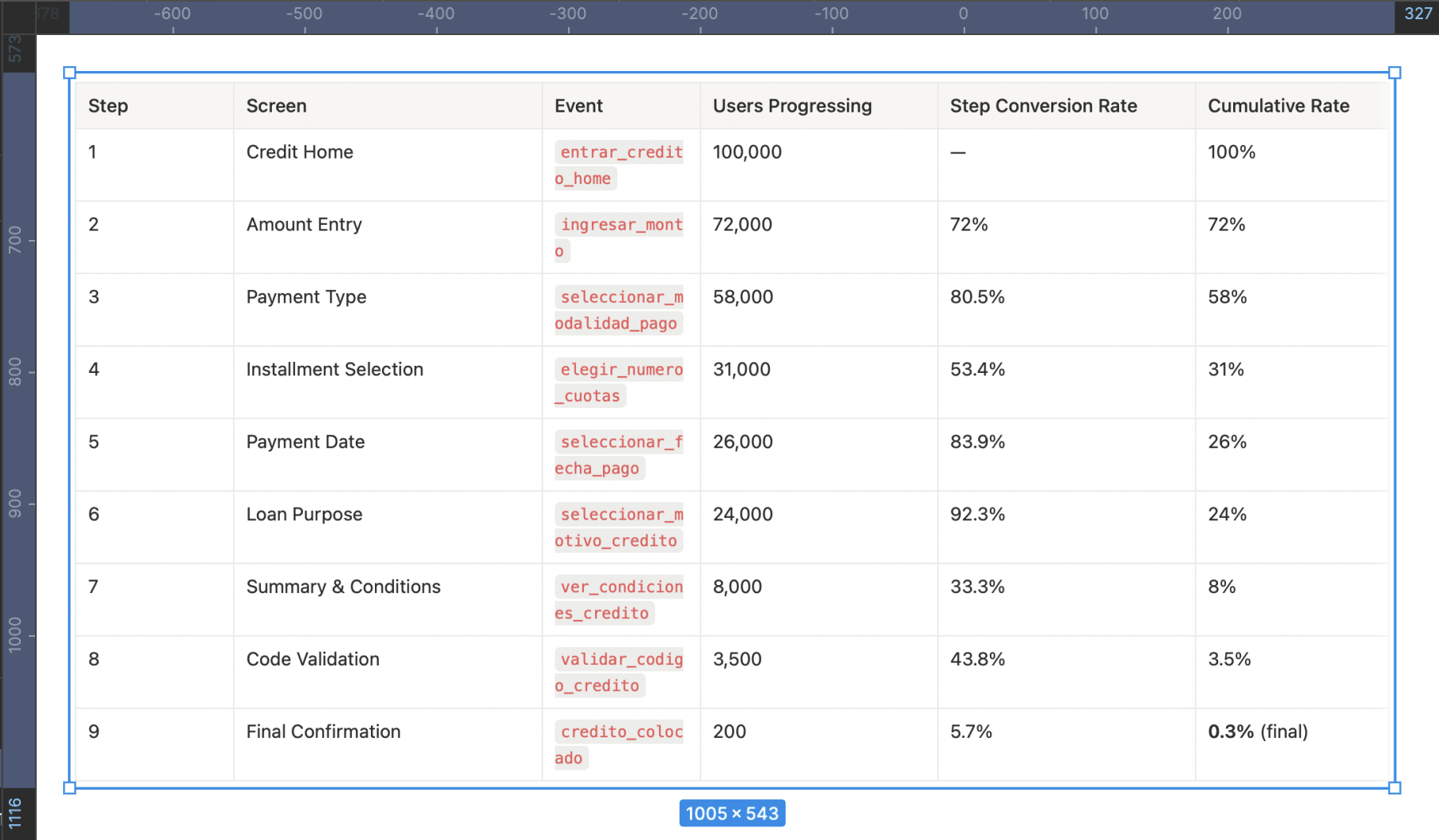
Visual Funnel Application Loan
Key Insights
- Biggest drop-off: Between “Summary & Conditions” and “Validation,” suggesting friction caused by distrust, doubts, or lack of clarity.
- High early abandonment (steps 1–4): Nearly 70% drop-off here, making this the most critical section where users face inconsistencies or fail to understand key information, leading to distrust.
- Silent abandonment in step 4 (installments): Likely due to perceived high cost or confusion about the total amount payable.
- Poorly qualified users advance too far: Many reach late steps without knowing if they’re eligible, which negatively impacts the overall experience and CES.
- 0.3% conversion rate: Validates the need to redesign abandonment points by increasing clarity, guidance, and trust during critical moments.
Affinity Map
Customer Journey Map
This map not only structures the user journey but also exposes the critical moments where the emotional experience breaks, affecting both conversion and trust.Each phase is aligned with a channel, an emotion, and a clear opportunity, allowing design and content decisions to be made based on real evidence.
User Emotional Journey Map
To build this journey, qualitative research was conducted, combining direct observation, in-depth interviews, and post-flow support analysis.
The goal was to understand not only what users do but what they feel, fear, and what stops them during the process. Two real users were interviewed (two who completed the flow and one who didn’t; ideally, there should have been seven) through moderated remote sessions.Each participant was asked to navigate the current flow on their own device while thinking aloud — expressing their thoughts, doubts, and emotions.
This technique made it possible to identify critical moments of insecurity, confusion, or cognitive overload that are not always verbalized spontaneously.
In parallel, three support tickets from the phone banking channel and three post-interaction email survey responseswere analyzed. These sources revealed common frictions related to the lack of clarity in credit conditions, distrust in the digital interface, and absence of explanations for automatic rejections.
The analysis of the Emotional Journey Map shows that the main negative emotions emerge during the simulation, offer evaluation, and confirmation stages — where users report feelings of confusion, insecurity, and fear.
These emotional states are not isolated but are a direct consequence of previously identified cognitive and trust-related frictions found in support tickets and surveys: lack of clarity about the total cost, technical or ambiguous language, and absence of mechanisms that reinforce understanding and control.
This convergence between the emotional and functional dimensions reinforces the initial hypothesis: the current flow fails not because of its structure, but because of its inability to build emotional security and operational transparency.
Key Findings Summary
The research revealed that the low conversion rate (0.3%) and low CES (71%) are not the result of a single error, but rather a chain of cognitive, emotional, and structural frictions that affect the user experience at multiple levels. These frictions are concentrated mainly in the core stages of the flow (simulation, evaluation, and summary), where users face a critical combination of informational ambiguity, distrust in the system, and lack of clear guidance.
Quantitative funnel analysis showed a 92% drop-off from entry to loan placement, with the most severe abandonments occurring at the “summary and conditions” step. This was validated qualitatively through interviews, contextual observations, and support ticket reviews, where users expressed feelings of confusion (“I don’t understand the total”), fear (“What am I agreeing to?”), and frustration (“I was rejected without explanation”).
A concerning pattern also emerged: the current design does not communicate eligibility from the start, does not educate users about the financial process, and fails to reinforce trust before the final decision.
In summary, the problem runs deeper than it appears — it’s not just about redesigning screens. It requires a structural transformation of the flow, guided by three core principles:
- Radical clarity to reduce ambiguity and cognitive load.
- Assisted autonomy to help users make informed decisions with contextual support.
- Trust built from the first screen through to the final resolution.
Find a more emotional way to capture the user’s attention.
Define
The Problem Statement allows me to articulate the challenge from its root, connecting structural causes with tangible metrics, aligning the business and stakeholders under an evidence-based narrative. The How Might We serves as a bridge between diagnosis and action, guiding ideation toward solutions that truly strengthen user understanding, control, and trust. Together, these tools transform the complexity of the problem into a clear design opportunity with measurable impact on both the user experience and business outcomes.
This matrix translates the complex findings from the Discover phase into a strategic action map that enables the team to decide where to invest design, development, and business efforts based on expected impact. It helps prioritize without falling into reactive decisions, avoiding wasted time on low-value initiatives or those with high emotional cost for the user.
Main Findings from Cross-Referencing the Impact/Effort Matrix with the Affinity Map
- The “confusion about credit terms” category (red affinity) directly connects with low-effort, high-impact initiatives such as a clear visual summary of conditions and explanatory microcopy. This validates that much of the abandonment is not due to technical complexity but rather to unnecessary cognitive load. The finding is clear: simplifying and visually prioritizing critical information can drive significant improvements without the need to restructure the entire flow.
- The “distrust and risk perception” category relates to solutions such as early eligibility messages, post-disbursement onboarding, and validation with fallback mechanisms. All of these have medium to high impact and variable effort. The pattern shows that trust is built before and after the critical action, not at the moment of conversion. This turns continuous support into a structural element of the experience, not just a UX add-on.
- The “cognitive load and inaccessible language” category overlaps with more demanding initiatives such as a guided step-by-step simulation and improvements in the legal content architecture. These require medium to high effort but offer a clear return in reducing the Customer Effort Score (CES). The key insight here is that financial language cannot be assumed to be neutral—if it isn’t explained, it becomes a blocker.
- “Rejection without explanation” frictions emerge as some of the most frustrating for users but have few low-effort solutions. Contextual feedback after rejection is high effort but essential to maintain perceptions of fairness and transparency. This aspect is critical for the product’s long-term credibility.
Finally, technical frictions (“failed validation” and “post-approval abandonment”) require strategic investment in backend and interaction design. Improving validation with fallback mechanisms and providing a clear post-loan dashboard not only addresses functional issues but also directly impacts experience continuity and user retention.
JTBD
Identify the Main Job (Main Functional Job)
What does the user really want to achieve—beyond using the app or completing a form?
In this case: Access money reliably, without uncertainty or friction, to solve a specific short-term need.
This step should not describe an action, but a desired outcome. Here, we avoid defining the job as “using a loan in Yape,” and instead redefine it as “solving an urgent need with clarity, security, and autonomy.”
Map the Emotional and Social Jobs
What emotions or social perceptions are involved in this decision-making process?
Emotional: Feeling in control, not vulnerable or exposed; reducing the anxiety of taking on debt without understanding it.
Social: Demonstrating responsibility to my surroundings (family, partner), maintaining the image of a reliable or financially responsible person.
Including these jobs allows us to design microcopy, validations, or guidance that reinforce not only the rational decision but also its emotional and reputational acceptance.
Define the Moments of Friction Within the Progress
Not understanding the total cost of the loan:The user cannot clearly visualize how much they will end up paying, what the total amount includes, or how values change when modifying the number of installments. This friction is cognitive but also emotional: the fear of going into debt without fully understanding the terms prevents progress.
Not knowing if they qualify from the start:Entering the flow without any indication of eligibility or pre-qualification creates uncertainty from the very first step. This gap undermines confidence and causes many users to proceed through trial and error, wearing down their perception and cognitive effort.
Not receiving feedback after being rejected:When a loan is denied, the user receives no clear explanation or alternative path (e.g., “what to improve” or “when to try again”). This reinforces a perception of arbitrariness, undermines the system’s legitimacy, and causes emotional disengagement.
Lack of clear guidance after disbursement:After receiving the loan, the user cannot easily find the payment schedule, reminders, or debt status. This lack of continuity produces lingering anxiety and erodes their sense of control.
These moments are far more than interface issues: they are breaks in the user’s emotional and functional progress that sabotage the purpose they sought through the loan. Identifying them gives design a truly strategic—not merely aesthetic—role.
Formulate the JTBD Statement
-“When I need to solve an urgent financial need from my phone, I want to clearly understand how much I’ll pay and feel in control of the process, so that I can make a safe, fast, and regret-free decision within an app I already use and trust”-
This statement accurately captures:
- The functional context: a real urgency handled through a familiar digital channel.
- The core need: clarity, control, and trust.
- The desired outcome: making an informed decision without doubts or unexpected negative consequences.
You can create variations to map different user types or situations, but this core statement covers the most representative and strategic case.
Success Criteria Based on the JTBD
To fulfill the user’s job, the experience must achieve the following:
- The user understands the total loan cost in less than 10 seconds.Success indicator: percentage of users who proceed after viewing the summary without going back or abandoning the flow.
- The user knows from the start whether they qualify for a loan.Indicator: reduction in mid-flow drop-off rate among ineligible users.
- The user feels confident and autonomous without human assistance.Indicator: post-flow CES improves to 85% or higher; fewer support tickets citing “I didn’t understand what I accepted.”
- The user has immediate and clear access to their payment schedule and debt.Indicator: number of visits to the installment and payment view within three days after disbursement.
- Rejected users receive a clear and understandable explanation.Indicator: lower volume of rejection-related tickets and higher intention to retry in the future.
The Moment of Truth
After of all collaborative work, user interviews, data analysis, ticket reviews, and the meticulous construction of design frameworks, the Product Owner of the digital channel approaches with a question that encapsulates the business’s expectations:
“Now that we’ve done all this research… what do we actually have? What do we know now that we didn’t know before? What was all this for?”
It’s a valid question. In fact, it’s the question every good product team should ask before making redesign decisions.
Develop
Desk Research
A comparative analysis was conducted on more than five relevant banking applications, focusing on their loan application flows. However, for this detailed study, three main applications were selected for their similarity in credit product features, allowing for a more precise and contextual strategic comparison with Yape’s current experience.
Strategic Insights from the Benchmark
Mercado Pago stands out for allowing users to simulate the total loan cost before starting the active application, but its flow tracking, rejection handling, and onboarding are absent—representing a clear opportunity for improvement in Yape.
PicPay, although not fully visible in its end-to-end flow, drives engagement through personalized recommendations and dynamic simulations, reinforcing a mental model of trust and contextual relevance.
Falabella emphasizes regulatory security but tends to be more rigid or confusing in rejection decisions and post-loan follow-up.
How can this be applied to Yape?
- Incorporate an initial simulator that clearly displays the total cost, supported by microcopy and legal backing.
- Add visual and communication trust elements on every screen (e.g., SBS seals, microcopy about data protection).
- Create a structured rejection flow with clear explanations of the reasons and alternative next steps.
- Design a proactive post-approval follow-up, including a payment schedule dashboard, notifications, and easy access to the payment plan.
Main Frictions Detected
Validation of Initial Wireframes
To begin creating the first wireframes with a strategic foundation aligned to the previous documentation, it’s essential to organize the work around critical moments of the flow, directly addressing identified frictions, insights, and opportunities.
Below is the prioritized list of elements to address:
1. Credit Landing Screen
- Eligibility clarity: personalized message like “You have a pre-approved offer.”
- Reduced visual hierarchy: remove competing CTAs and highlight the primary action.
- Trust microcopy: “No hidden fees,” “Quick review,” etc.
2. Guided Simulator
- Step 1: Loan amount with immediate feedback if the value is out of range.
- Step 2: Payment type (single or multiple installments) with visual explanation.
- Step 3: Number of installments with a progressive breakdown of the total amount to pay.
- Dynamic visualization of interest impact based on user choices.
3. Offer Summary
- Clear visual hierarchy: monthly payment, total to pay, rates.
- Checklist with icons: “Your loan includes,” “Does not include,” “Term,” “First payment.”
- Validated CTA: “I want this option,” with a reminder of terms and conditions.
4. Validation and Confirmation
- SMS code input screen with a clear fallback: “Didn’t receive the code?”
- Estimated validation time with a progress indicator component.
- Emotional success message: “Your loan was approved. The money will be deposited within X hours.”
5. Post-Approval
- Post-loan onboarding: summary of installments, key dates, and next steps.
- Direct access to the payment schedule.
- FAQ or support section for common questions.
6. Alternative Rejection Flow
- Empathetic and clear message: “This time we couldn’t approve your loan.”
- Guiding reason: e.g., “You didn’t meet the minimum requirements.”
- Recovery call to action: “Learn how to improve your eligibility.”
7. Reusable Trust Component
- Security badges, legal icons, and certified accessibility (SBS and privacy).
- Inclusive and explanatory language throughout the flow.
Prototype
This high-fidelity, interactive prototype faithfully recreates the end-to-end experience of the redesigned multi-installment credit flow. It not only validates key usability improvements but also acts as a single source of truth to align business, technical, and legal stakeholders. Every interaction reflects decisions grounded in user research, WCAG 2.2 accessibility standards, and core business KPIs — ensuring an experience that drives conversion, builds trust, and minimizes user effort.
Explore the prototype
To view the prototype in full screen, click this button:
To restart the prototype from the first screen, click this button:
Post-Launch Metrics Analysis
- Experimental design: A/B test 50/50 (Control = current flow, Test = redesign), 6 weeks, random and mutually exclusive audiences.
- Unit of analysis: sessions with credit intent (event entrar_credito_home).
- Instrumentation: events per funnel step, timestamps for time-to-complete, eligibility attributes, SMS/OTP status, rejection reasons, accessibility (use of Dynamic Type, screen reader), device/OS, and network.
- North Star metric: conversion rate to “loan disbursed.”
- Guardrails: transactional CES, rejection rate, technical friction (OTP failures), crash-free sessions, load times, and early delinquency metrics (D+7/D+30).
“Experience & Effort” Dashboard
- Transactional CES post-flow (CSAT/CES blend).
- % of users going back from “Summary and conditions.”
- Perceived clarity (1-question micro-survey: “Did you understand the total cost?” (Yes/No).
“Explained Rejections” Dashboard
- % of rejections with a displayed reason.
- 30-day retry rate.
- Tickets tagged as “rejection without explanation.”
Learnings & Reflections
This project was not just an exercise in designing screens, but a strategic effort that spanned several months and activated the full spectrum of my skills as a Senior Product Designer. From deep qualitative research to facilitating stakeholder alignment workshops and prioritizing high-impact initiatives, every phase created measurable impact within the organization. The research became a constant reference point: it is still mentioned today in leadership meetings and business teams as an example of how a well-structured discovery process can transform a product strategy.
What I’m Most Proud Of
What I value most from this project is transforming an abstract problem (“low conversion”) into a clear, actionable diagnosis that guided the entire redesign strategy. The qualitative research I led — interviews, observations, and ticket analysis — not only uncovered UX frictions but also revealed the emotional and cognitive roots of user drop-off: distrust, fear, and lack of clarity. This work was not just “research”; it was business design.
What I Would Have Done Differently
Although we uncovered highly valuable insights, I would have enriched the process with three additional actions:
- Early usability testing: Testing low-fidelity prototypes before aligning the roadmap with development would have been valuable to detect micro-interaction frictions and optimize earlier, reducing technical effort later.
- Real-time impact measurement: I would have liked to implement CES and conversion metrics directly within the prototype to measure improvements before release.
What I Would Do Next
The conclusions remain fully relevant: radical clarity, assisted autonomy, and built trust must continue to be the pillars of the product.
If I were to move forward with the next phase, I would focus on:
- Data-driven iteration: Measure conversion and CES post-launch in real time to identify optimization opportunities.
- Contextual financial education: Add micro-learning within the flow to help users make responsible decisions.
- Gamified post-loan onboarding: Transform debt management into a positive, proactive experience that strengthens user trust in Yape.
- Multichannel strategy: Ensure consistency across communication (app, email, notifications) to reduce doubts and support tickets.
Ultimately, this project taught me that designing fintech experiences is not just about creating usable interfaces — it’s about building trust in a context where people are putting their financial and emotional security on the line. That is the true measure of success.
Professional website of José Manuel Zevallos
Digital Media Designer © 2025. All rights reserved.
zevallosj147@gmail.com
LinkedIn: in/jmanuelzevallos
2025
Increase Conversion Rate and CES for the Personal Loan Feature in a Fintech App
José Manuel Zevallos, Stanford University
Challenge
Redesign, prototype, and test Yape’s multi-installment credit feature with the goal of:
- Increasing user conversion from 0.3% to 2.3%
- Improving the transactional Customer Effort Score (CES) from 68% to 85%
- Raising the number of loans granted from 80K to 140K per month
The proposed solution must comply with all legal regulations and accessibility standards required by the Peruvian Superintendence of Banking and Insurance (SBS).
Hypothesis
We believe the low conversion rate and CES in the multi-installment credit feature are due to users not clearly understanding the loan conditions, distrusting the digital process, or encountering friction when trying to simulate, compare, or confirm their request.
If we redesign the experience to align with the real progress users seek (control, clarity, speed, and trust), we will increase conversion, improve perceived effort, and accelerate loan placements.
Summary
With the sustained increase in demand for digital financial products, Yape identified a key opportunity to improve the experience of its multi-installment credit feature. Although already live in production, this solution showed an extremely low conversion rate (0.3%) and a transactional Customer Effort Score (CES) of 85%, revealing significant friction points in the process. In this context, redesigning the entire digital experience was defined as a strategic priority. This involved mapping all user touchpoints along the journey to uncover the true barriers preventing users from progressing and to create a solution aligned with their motivations, expectations, and trust level in digital credit products.
Problem Users Faced
Users could not find a clear, trustworthy, or decision-oriented experience. The current interface caused confusion about loan amounts, installments, and conditions, and lacked enough guidance or validation throughout the process. Without an experience that conveyed clarity, transparency, and support, many users abandoned the flow before completing the application.
Business Objective
Increase adoption and recurring use of Yape’s multi-installment credit feature as a key tool to retain users within the ecosystem, strengthen brand loyalty, and boost platform usage frequency. By making access to digital microcredits easier—helping users solve real needs or achieve personal goals—Yape aims to position itself as a trusted financial partner that delivers sustained value in customers’ lives.
Product Owner & Business Request
To research, evaluate, propose, and design a new experience for the multi-installment credit feature with the goal of increasing conversion, improving the perceived user effort, and boosting monthly loan placement — while ensuring compliance with SBS legal and accessibility guidelines.
Applied Methodology
To tackle this challenge, we applied the Double Diamond methodology, complemented by the Jobs to Be Done (JTBD) framework. This approach not only structured the design process clearly but also uncovered the underlying motivations driving users to request a multi-installment loan, enabling us to align business goals with user needs.
This case study has been adapted for demonstration purposes only. Names, data, metrics, and specific details have been modified to protect the confidentiality of the companies involved and to avoid disclosing sensitive information. This document focuses on showcasing the strategic design process, evidence-based decision-making, and potential impact on user experience. The examples faithfully represent typical challenges without compromising the privacy of teams or real users.
Discover
Here we start by generating a holistic understanding of the problem, integrating quantitative and qualitative data to map not only user behavior but also business dependencies, technical constraints, and the regulatory context. My approach goes beyond identifying friction points in the flow — it focuses on uncovering strategic opportunities that align business objectives with the users’ true motivations, prioritizing the issues with the greatest impact on conversion and trust.
Current funnel mapping
Step-by-step details
Initial Hypotheses Based on the Funnel
- High drop-off in steps 4–7: When financial information appears, many users stop or abandon. Conditions are not clear enough or generate distrust.
- Summary overwhelms instead of simplifying: The conditions screen lacks visual hierarchy. The breakdown informs but doesn’t educate. This goes against heuristics like “visibility of system status” and “help and documentation.”
- Waiting times for validation: If the SMS code doesn’t arrive quickly or errors occur, abandonment is likely.
- No early eligibility indicators: Many users could reach step 7 without knowing if they actually qualify. This creates frustration.
- Lack of emotional transparency: No messages build trust or emotional reassurance during the process (e.g., “Your loan is secure,” “No hidden fees”).
Visual Funnel Application Loan
Key Insights
- Biggest drop-off: Between “Summary & Conditions” and “Validation,” suggesting friction caused by distrust, doubts, or lack of clarity.
- High early abandonment (steps 1–4): Nearly 70% drop-off here, making this the most critical section where users face inconsistencies or fail to understand key information, leading to distrust.
- Silent abandonment in step 4 (installments): Likely due to perceived high cost or confusion about the total amount payable.
- Poorly qualified users advance too far: Many reach late steps without knowing if they’re eligible, which negatively impacts the overall experience and CES.
- 0.3% conversion rate: Validates the need to redesign abandonment points by increasing clarity, guidance, and trust during critical moments.
Affinity Map
Customer Journey Map
This map not only structures the user journey but also exposes the critical moments where the emotional experience breaks, affecting both conversion and trust.Each phase is aligned with a channel, an emotion, and a clear opportunity, allowing design and content decisions to be made based on real evidence.
User Emotional Journey Map
To build this journey, qualitative research was conducted, combining direct observation, in-depth interviews, and post-flow support analysis.
The goal was to understand not only what users do but what they feel, fear, and what stops them during the process. Two real users were interviewed (two who completed the flow and one who didn’t; ideally, there should have been seven) through moderated remote sessions.Each participant was asked to navigate the current flow on their own device while thinking aloud — expressing their thoughts, doubts, and emotions.
This technique made it possible to identify critical moments of insecurity, confusion, or cognitive overload that are not always verbalized spontaneously.
In parallel, three support tickets from the phone banking channel and three post-interaction email survey responseswere analyzed. These sources revealed common frictions related to the lack of clarity in credit conditions, distrust in the digital interface, and absence of explanations for automatic rejections.
The analysis of the Emotional Journey Map shows that the main negative emotions emerge during the simulation, offer evaluation, and confirmation stages — where users report feelings of confusion, insecurity, and fear.
These emotional states are not isolated but are a direct consequence of previously identified cognitive and trust-related frictions found in support tickets and surveys: lack of clarity about the total cost, technical or ambiguous language, and absence of mechanisms that reinforce understanding and control.
This convergence between the emotional and functional dimensions reinforces the initial hypothesis: the current flow fails not because of its structure, but because of its inability to build emotional security and operational transparency.
Key Findings Summary
The research revealed that the low conversion rate (0.3%) and low CES (71%) are not the result of a single error, but rather a chain of cognitive, emotional, and structural frictions that affect the user experience at multiple levels. These frictions are concentrated mainly in the core stages of the flow (simulation, evaluation, and summary), where users face a critical combination of informational ambiguity, distrust in the system, and lack of clear guidance.
Quantitative funnel analysis showed a 92% drop-off from entry to loan placement, with the most severe abandonments occurring at the “summary and conditions” step. This was validated qualitatively through interviews, contextual observations, and support ticket reviews, where users expressed feelings of confusion (“I don’t understand the total”), fear (“What am I agreeing to?”), and frustration (“I was rejected without explanation”).
A concerning pattern also emerged: the current design does not communicate eligibility from the start, does not educate users about the financial process, and fails to reinforce trust before the final decision.
In summary, the problem runs deeper than it appears — it’s not just about redesigning screens. It requires a structural transformation of the flow, guided by three core principles:
- Radical clarity to reduce ambiguity and cognitive load.
- Assisted autonomy to help users make informed decisions with contextual support.
- Trust built from the first screen through to the final resolution.
Find a more emotional way to capture the user’s attention.
Define
The Problem Statement allows me to articulate the challenge from its root, connecting structural causes with tangible metrics, aligning the business and stakeholders under an evidence-based narrative. The How Might We serves as a bridge between diagnosis and action, guiding ideation toward solutions that truly strengthen user understanding, control, and trust. Together, these tools transform the complexity of the problem into a clear design opportunity with measurable impact on both the user experience and business outcomes.
This matrix translates the complex findings from the Discover phase into a strategic action map that enables the team to decide where to invest design, development, and business efforts based on expected impact. It helps prioritize without falling into reactive decisions, avoiding wasted time on low-value initiatives or those with high emotional cost for the user.
Main Findings from Cross-Referencing the Impact/Effort Matrix with the Affinity Map
- The “confusion about credit terms” category (red affinity) directly connects with low-effort, high-impact initiatives such as a clear visual summary of conditions and explanatory microcopy. This validates that much of the abandonment is not due to technical complexity but rather to unnecessary cognitive load. The finding is clear: simplifying and visually prioritizing critical information can drive significant improvements without the need to restructure the entire flow.
- The “distrust and risk perception” category relates to solutions such as early eligibility messages, post-disbursement onboarding, and validation with fallback mechanisms. All of these have medium to high impact and variable effort. The pattern shows that trust is built before and after the critical action, not at the moment of conversion. This turns continuous support into a structural element of the experience, not just a UX add-on.
- The “cognitive load and inaccessible language” category overlaps with more demanding initiatives such as a guided step-by-step simulation and improvements in the legal content architecture. These require medium to high effort but offer a clear return in reducing the Customer Effort Score (CES). The key insight here is that financial language cannot be assumed to be neutral—if it isn’t explained, it becomes a blocker.
- “Rejection without explanation” frictions emerge as some of the most frustrating for users but have few low-effort solutions. Contextual feedback after rejection is high effort but essential to maintain perceptions of fairness and transparency. This aspect is critical for the product’s long-term credibility.
Finally, technical frictions (“failed validation” and “post-approval abandonment”) require strategic investment in backend and interaction design. Improving validation with fallback mechanisms and providing a clear post-loan dashboard not only addresses functional issues but also directly impacts experience continuity and user retention.
JTBD
Identify the Main Job (Main Functional Job)
What does the user really want to achieve—beyond using the app or completing a form?
In this case: Access money reliably, without uncertainty or friction, to solve a specific short-term need.
This step should not describe an action, but a desired outcome. Here, we avoid defining the job as “using a loan in Yape,” and instead redefine it as “solving an urgent need with clarity, security, and autonomy.”
Map the Emotional and Social Jobs
What emotions or social perceptions are involved in this decision-making process?
Emotional: Feeling in control, not vulnerable or exposed; reducing the anxiety of taking on debt without understanding it.
Social: Demonstrating responsibility to my surroundings (family, partner), maintaining the image of a reliable or financially responsible person.
Including these jobs allows us to design microcopy, validations, or guidance that reinforce not only the rational decision but also its emotional and reputational acceptance.
Define the Moments of Friction Within the Progress
Not understanding the total cost of the loan:The user cannot clearly visualize how much they will end up paying, what the total amount includes, or how values change when modifying the number of installments. This friction is cognitive but also emotional: the fear of going into debt without fully understanding the terms prevents progress.
Not knowing if they qualify from the start:Entering the flow without any indication of eligibility or pre-qualification creates uncertainty from the very first step. This gap undermines confidence and causes many users to proceed through trial and error, wearing down their perception and cognitive effort.
Not receiving feedback after being rejected:When a loan is denied, the user receives no clear explanation or alternative path (e.g., “what to improve” or “when to try again”). This reinforces a perception of arbitrariness, undermines the system’s legitimacy, and causes emotional disengagement.
Lack of clear guidance after disbursement:After receiving the loan, the user cannot easily find the payment schedule, reminders, or debt status. This lack of continuity produces lingering anxiety and erodes their sense of control.
These moments are far more than interface issues: they are breaks in the user’s emotional and functional progress that sabotage the purpose they sought through the loan. Identifying them gives design a truly strategic—not merely aesthetic—role.
Formulate the JTBD Statement
-“When I need to solve an urgent financial need from my phone, I want to clearly understand how much I’ll pay and feel in control of the process, so that I can make a safe, fast, and regret-free decision within an app I already use and trust”-
This statement accurately captures:
- The functional context: a real urgency handled through a familiar digital channel.
- The core need: clarity, control, and trust.
- The desired outcome: making an informed decision without doubts or unexpected negative consequences.
You can create variations to map different user types or situations, but this core statement covers the most representative and strategic case.
Success Criteria Based on the JTBD
To fulfill the user’s job, the experience must achieve the following:
- The user understands the total loan cost in less than 10 seconds.Success indicator: percentage of users who proceed after viewing the summary without going back or abandoning the flow.
- The user knows from the start whether they qualify for a loan.Indicator: reduction in mid-flow drop-off rate among ineligible users.
- The user feels confident and autonomous without human assistance.Indicator: post-flow CES improves to 85% or higher; fewer support tickets citing “I didn’t understand what I accepted.”
- The user has immediate and clear access to their payment schedule and debt.Indicator: number of visits to the installment and payment view within three days after disbursement.
- Rejected users receive a clear and understandable explanation.Indicator: lower volume of rejection-related tickets and higher intention to retry in the future.
The Moment of Truth
After of all collaborative work, user interviews, data analysis, ticket reviews, and the meticulous construction of design frameworks, the Product Owner of the digital channel approaches with a question that encapsulates the business’s expectations:
“Now that we’ve done all this research… what do we actually have? What do we know now that we didn’t know before? What was all this for?”
It’s a valid question. In fact, it’s the question every good product team should ask before making redesign decisions.
Develop
Desk Research
A comparative analysis was conducted on more than five relevant banking applications, focusing on their loan application flows. However, for this detailed study, three main applications were selected for their similarity in credit product features, allowing for a more precise and contextual strategic comparison with Yape’s current experience.
Strategic Insights from the Benchmark
Mercado Pago stands out for allowing users to simulate the total loan cost before starting the active application, but its flow tracking, rejection handling, and onboarding are absent—representing a clear opportunity for improvement in Yape.
PicPay, although not fully visible in its end-to-end flow, drives engagement through personalized recommendations and dynamic simulations, reinforcing a mental model of trust and contextual relevance.
Falabella emphasizes regulatory security but tends to be more rigid or confusing in rejection decisions and post-loan follow-up.
How can this be applied to Yape?
- Incorporate an initial simulator that clearly displays the total cost, supported by microcopy and legal backing.
- Add visual and communication trust elements on every screen (e.g., SBS seals, microcopy about data protection).
- Create a structured rejection flow with clear explanations of the reasons and alternative next steps.
- Design a proactive post-approval follow-up, including a payment schedule dashboard, notifications, and easy access to the payment plan.
Main Frictions Detected
Validation of Initial Wireframes
To begin creating the first wireframes with a strategic foundation aligned to the previous documentation, it’s essential to organize the work around critical moments of the flow, directly addressing identified frictions, insights, and opportunities.
Below is the prioritized list of elements to address:
1. Credit Landing Screen
- Eligibility clarity: personalized message like “You have a pre-approved offer.”
- Reduced visual hierarchy: remove competing CTAs and highlight the primary action.
- Trust microcopy: “No hidden fees,” “Quick review,” etc.
2. Guided Simulator
- Step 1: Loan amount with immediate feedback if the value is out of range.
- Step 2: Payment type (single or multiple installments) with visual explanation.
- Step 3: Number of installments with a progressive breakdown of the total amount to pay.
- Dynamic visualization of interest impact based on user choices.
3. Offer Summary
- Clear visual hierarchy: monthly payment, total to pay, rates.
- Checklist with icons: “Your loan includes,” “Does not include,” “Term,” “First payment.”
- Validated CTA: “I want this option,” with a reminder of terms and conditions.
4. Validation and Confirmation
- SMS code input screen with a clear fallback: “Didn’t receive the code?”
- Estimated validation time with a progress indicator component.
- Emotional success message: “Your loan was approved. The money will be deposited within X hours.”
5. Post-Approval
- Post-loan onboarding: summary of installments, key dates, and next steps.
- Direct access to the payment schedule.
- FAQ or support section for common questions.
6. Alternative Rejection Flow
- Empathetic and clear message: “This time we couldn’t approve your loan.”
- Guiding reason: e.g., “You didn’t meet the minimum requirements.”
- Recovery call to action: “Learn how to improve your eligibility.”
7. Reusable Trust Component
- Security badges, legal icons, and certified accessibility (SBS and privacy).
- Inclusive and explanatory language throughout the flow.
Prototype
This high-fidelity, interactive prototype faithfully recreates the end-to-end experience of the redesigned multi-installment credit flow. It not only validates key usability improvements but also acts as a single source of truth to align business, technical, and legal stakeholders. Every interaction reflects decisions grounded in user research, WCAG 2.2 accessibility standards, and core business KPIs — ensuring an experience that drives conversion, builds trust, and minimizes user effort.
Explore the prototype
To view the prototype in full screen, click this button:
To restart the prototype from the first screen, click this button:
Post-Launch Metrics Analysis
- Experimental design: A/B test 50/50 (Control = current flow, Test = redesign), 6 weeks, random and mutually exclusive audiences.
- Unit of analysis: sessions with credit intent (event entrar_credito_home).
- Instrumentation: events per funnel step, timestamps for time-to-complete, eligibility attributes, SMS/OTP status, rejection reasons, accessibility (use of Dynamic Type, screen reader), device/OS, and network.
- North Star metric: conversion rate to “loan disbursed.”
- Guardrails: transactional CES, rejection rate, technical friction (OTP failures), crash-free sessions, load times, and early delinquency metrics (D+7/D+30).
“Experience & Effort” Dashboard
- Transactional CES post-flow (CSAT/CES blend).
- % of users going back from “Summary and conditions.”
- Perceived clarity (1-question micro-survey: “Did you understand the total cost?” (Yes/No).
“Explained Rejections” Dashboard
- % of rejections with a displayed reason.
- 30-day retry rate.
- Tickets tagged as “rejection without explanation.”
Learnings & Reflections
This project was not just an exercise in designing screens, but a strategic effort that spanned several months and activated the full spectrum of my skills as a Senior Product Designer. From deep qualitative research to facilitating stakeholder alignment workshops and prioritizing high-impact initiatives, every phase created measurable impact within the organization. The research became a constant reference point: it is still mentioned today in leadership meetings and business teams as an example of how a well-structured discovery process can transform a product strategy.
What I’m Most Proud Of
What I value most from this project is transforming an abstract problem (“low conversion”) into a clear, actionable diagnosis that guided the entire redesign strategy. The qualitative research I led — interviews, observations, and ticket analysis — not only uncovered UX frictions but also revealed the emotional and cognitive roots of user drop-off: distrust, fear, and lack of clarity. This work was not just “research”; it was business design.
What I Would Have Done Differently
Although we uncovered highly valuable insights, I would have enriched the process with three additional actions:
- Early usability testing: Testing low-fidelity prototypes before aligning the roadmap with development would have been valuable to detect micro-interaction frictions and optimize earlier, reducing technical effort later.
- Real-time impact measurement: I would have liked to implement CES and conversion metrics directly within the prototype to measure improvements before release.
What I Would Do Next
The conclusions remain fully relevant: radical clarity, assisted autonomy, and built trust must continue to be the pillars of the product.
If I were to move forward with the next phase, I would focus on:
- Data-driven iteration: Measure conversion and CES post-launch in real time to identify optimization opportunities.
- Contextual financial education: Add micro-learning within the flow to help users make responsible decisions.
- Gamified post-loan onboarding: Transform debt management into a positive, proactive experience that strengthens user trust in Yape.
- Multichannel strategy: Ensure consistency across communication (app, email, notifications) to reduce doubts and support tickets.
Ultimately, this project taught me that designing fintech experiences is not just about creating usable interfaces — it’s about building trust in a context where people are putting their financial and emotional security on the line. That is the true measure of success.
Rol
Product Design
UX Strategist
UI Design
Category
App mobile
iOS / Android
Project Type
Banking app
Loan Application Journey
Professional website of José Manuel Zevallos
Digital Media Designer © 2025. All rights reserved.
zevallosj147@gmail.com
LinkedIn: in/jmanuelzevallos